
On Tuesday,
29th September 2015, our class had a second review of our semester
progress with Miss Ida following the one week holiday. For this second review,
we were required to showcase to Miss the progress we have on our assignments.
This included our logo rationale (which I have made a post on previously
here), stationery items, a portrait vector, our product packaging, and our
website layout.
For Rizqin
Co.’s stationery items, I decided to go with a simple and practical design
which uses gradients of green, white and blue in a subtle way to not distract
the purpose of the stationery. The stationary items that are required are the
business card, envelope and letterhead. Hence, here are several designs that I
have come up with for the business card.

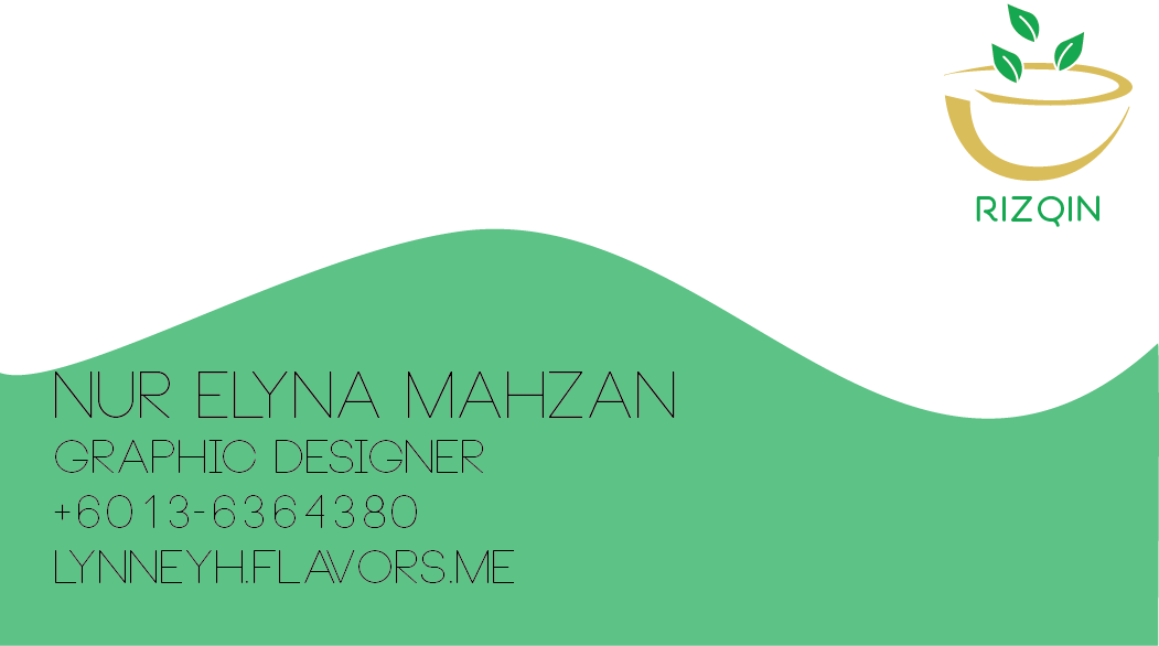


I have
decided to go with this design as it is simple and uses more white space; hence
it is suitable as a medium of exchanging information. The company logo is
placed on the front and back of the card and the borders is set not only to
avoid bleeding, but also to frame the information into the card.
 |
| Front |
 |
| Back |
Following
the design of the business card, I have designed the envelope and letterhead to
be of a similar concept, which is the gradient border. Here are the final
designs.


-
As a follow
up of my previous post on my portrait vector, I will be explaining the process
of designing my vector, if that makes sense. Basically, making vectors is a
skill that is mostly based on your style of creating. However, when I tried to fit my vector to my concept, it was slightly difficult to me.
I preceded
making white circles to make an image of ‘cropped off’. The end product was not
very satisfying, though.

So I
decided to make the circles of color to make the image of ‘cropped off’ appear more
real. The end product looked better, however Miss commented on how my skin
color didn’t look good and that the black jubbah was distracting, hence I made
a few changes. Below is the initial end product, followed by the edited
version.


-
Our first post on this blog was about our product research, and there had not
been any updates about it since. Therefore, today I will be answering your question; “What in
the world happened to their product packaging assignment??!?” Well, it had
taken quite some time to finalize the design I will be using due to the many
great references available in the market and online. In that amount of time, I had decided, since the
main target audiences are families, that the design will have a classic, family
oriented look with fruit illustrations. Here is the edited design after it was
reviewed.

 |
| Not entirely done just yet - the fruit illustration is still on hold and there are still some things I will need to fix. |
The fonts
used are Clementine, which has a classic penmanship look for the homey concept
of the design, and Ouda, which promotes friendliness towards food &
beverage products. The fruits are illustrated to look simple while still maintaining its naturally organic shapes. While there are
five flavors available with my product, Dairy Pixie, I will be printing only
two flavors, which are blueberries and grapefruit.
-
Previously,
I had made a post on my website layout for Rumah Johor. However, since that
post, a lot has changed for my website layout, and I am sure more changes will
be made in the future due to the lack of quality in the current design.
After
changing my references, I had decided to include a loading page to my website.
The loading page and the homepage will look relatively similar except for the
‘enter’ button, which is a photograph of the house. The other pages will have
an empty background to bring the reader’s focus towards the content, and
include History, Features, Gallery and About Us. The idea of using gold yellow
and dark brown as its main colors might be changed or adapted to fit a more
modern look with pastel colors, as Miss had suggested. However, here are the
three pages that I had presented.


And with
that, I conclude today’s post. I hope this brief yet stacked-on update was
informative on our progress and will build up hype for our final showcase at
the end of the semester! I am working hard to make sure I will provide quality
products and designs not only for my university applications, but also to make
sure our exhibition is enjoyable to all, and everyone will come and visit us.
Therefore, until then!
-Elyna
Mahzan, out.
No comments:
Post a Comment