"Alright, bring 10 photos of yourselves to class next week. We're making vector portraits."
Here come the waves of insecurities and self-doubt. It didn't last, though, since I've accepted the fact that lighting and angles certainly can and did help me take good photos of myself, and that I can at least hope that I have decent selfies to sell. That being said, after a weekend of searching, I found no good photos of me that weren't selfies. What a blow to my self-confidence that was.
But before we take a look at the top three selfies I managed to dig up among the pile, let's have a look at the styles of vectors I'd like to try.
In a rush, I compiled the few styles of vector portraits I endeared the most, and both of them seem like complete opposites to each other:
The First Style is one that seems to be a style that centralizes bright, almost nauseating neon colors. It's so otherworldly without trying to be, although those colors would clearly make much less sense used in other contexts, with triggered my interest a lot. A few examples of these can be seen below.
 |
James Dean by Mel Marcelo, a very talented graphic designer. I absolutely love how jagged and sharp his lines are, and how natural he makes them look on the human face.
|
 |
Pop art-styled poster by Vitali Lakovlev. I love the use of neon colors here, and how they contrast each other so much but work so well. I also applaud him for making green faces attractive and not Hulk-ish.
|
 |
| Here is a beautiful self-portrait vector by Aeonna on Deviantart. I absolutely love her colors, especially, though the photo may be a bit overexposed. Though, I like that effect. |
The Second Style is one that literally caught my eye the moment Ms. Ida showed it to us during our introduction to vectors, and never left my mind ever since. I was always known as a "square," and am infamous for my love of everything geometrical, despite being allergic to rulers. So, you can probably already guess what the second style actually looks like:
 |
This geometric WPAP vector was the image shown to us that day, and I never stopped going "THAT'S SO COOOOOOL," not even for a second.
|
 |
| This one is by Seto Buje, an Indonesian artist. Significantly simple, but elegant. |
 |
| This Paul McCartney vector portrait by Damara Alif seems borderline pixelated, but that's what makes it look cool, retro and hip. Did I really just use the word "hip"? Truly, I am actually a 40-year-old man inside. |
 |
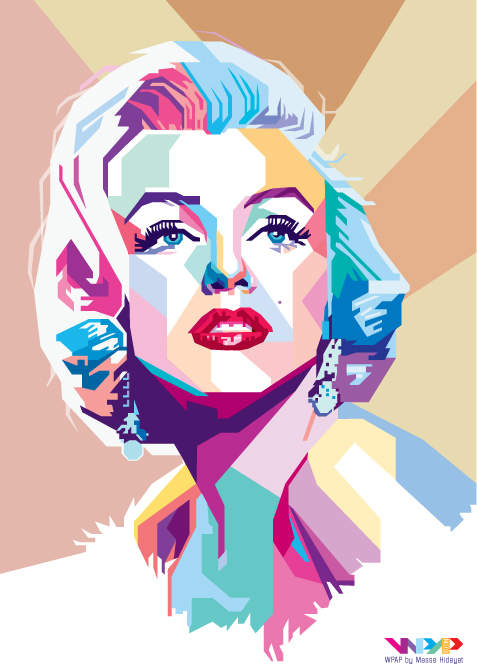
| Masse Hidayat's Marilyn Monroe vector looks excruciatingly beautiful with his use of both pastel and bright colors, pairing them with earthy tones for the background to really let the subject shine. |
 |
| Lastly, we have Fad02Fad's rendition of Elle Fanning. I saved this one for last, seeing as it is one of my favorites. I love the way he vectored her messy hair, and how he managed to use so many different colors and make them work. |
Now, onto the true tricky part, which was choosing my photo...
 |
| This is a terribly old photo of me, back when I was pristine... This photo won 3rd place. |
 |
| This is one of my favorite photos, taken during Raya this year. Sadly, I have the risk of turning myself into a horrific floating head if I mess up on this one, so it falls second (at least, until I find the way to make it work, maybe, hopefully). |
 |
In the end, this selfie won the lot. It just screams the word "vector," and albeit the fact that it seems plain and uninteresting, I decided it'll be my job to make the most of the photo. That being said, wow, this photo looks... Blurry...
Either way! I'll have to try to make this work, no matter what! Godspeed! |


No comments:
Post a Comment