
I'm back again with another entry~!!
But this time, it's on my web research.
In this entry, I will be talking about my website layout
and also some of the contents that I will use for the website.
Let us start with my sketches of the website layout for each page!
These are just the digitized early prototypes of my website layout sketches:
 |
| Home Page 1 |
 |
| Home Page 2 |
For my homepage, I would like to go for a slideshow front or a photo collage front as I would think that it would look good.
Also, I would also go for a minimalist concept for the website as to not create too much cluttering of info or distracting the users who visit the website.
[But I guess my sketches doesn't show that well enough, haha..]
I also would like to put some sort of logo or banner on the website as to show a brief summary of the website or author of the website.
 |
| Content pages |
As for the content pages, I would also go for the same layout.
This is to avoid confusion for the users who navigate through the website.
Plus, the buttons would have to be on the same place [and the ads too]
for the users convenience when they want to click on other links easily.
Also, for the content, it will be in a box [where the photo collage/slideshow section is].
The users will face some photos inside the box included with descriptions of the photo.
[However, content pages will have slight differences with other pages to increase the attractiveness of the website but I did not put the sketches in this entry.]
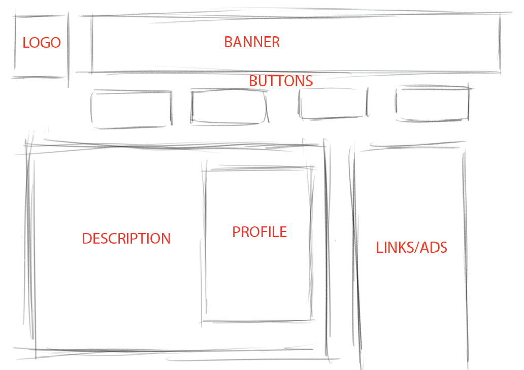 |
| Profile page |
As for the profile page, I would also go for the same layout because it is simple.
However, users don't need to scroll to read the description as it will be short and concise
[I don't have much to talk about myself.. pfft!]
Now, moving onto the color of the website, I would like to go for vintage colors,
Perhaps pastel palettes.
 |
| Winter Pastels [Source: Google] |
 |
| Vintage Palette [Source: Google] |
I chose these colors because it is easy on the eyes and I would also like the user to focus more on the content and buttons instead of the background.
Thus, my exact reason to not use any illustrated backgrounds.
However, if it's a simple spiral or flowery illustration on the background, I will use it to promote floral designs on my subject matter for my web research, which is the Rumah Melaka.
In a nutshell, these are my website layout research for my website project.
It's not much but I will update more on my progress as I go by.
With that, I thank you for reading my humble entry.
Good day! [or night]
 |
| I'm dying here.. |
No comments:
Post a Comment