
After figuring out what type of product I wanted to sell,
then comes the important part.
I had to pick out a company name, a product name, a
slogan/catchphrase (if any), a mascot (if any), and last but not least, a logo.
I had a few ideas of what I wanted my company and my logo to
be like so I wrote them down:


Then, I started thinking of interesting chocolate company
names. The first one that popped into my head was ‘Chocolate City.’ There were
also a few others:

I sketched several logos for the company names that I’ve
thought of and even came up with a few slogans and catchphrases for some of
them.


Next, I treid to come up with some brand names for the types
of chocolate I wanted to produce. I had some ideas (none of which have been
finalized up to this day)


After several sketches and consultations, unfortunately it
was discovered that most of the company names weren’t suitable enough.
So in the end I settled with ‘Chocolatarian.’
Chocolatarian means a person who creates/makes chocolates.
Since my company is producing chocolates, I thought it was
appropriate.
After establishing a satisfactory company name, I had to
design my company logo.
At first I thought having a face of a chef would look interesting as my company
name IS Chocolatarian so why not have a
face of one in the logo? So I sketched it out and added some colour to it.

Then I decided to proceed with my idea digitally. However, I dint manage to complete it before I realized that it wasn’t such a good idea. As was told by my lecturer, it wasn’t simple enough. Company logo’s are supposed to be simple as it will appear in all of our products, our business cards and even our letterheads.

Then I decided to proceed with my idea digitally. However, I dint manage to complete it before I realized that it wasn’t such a good idea. As was told by my lecturer, it wasn’t simple enough. Company logo’s are supposed to be simple as it will appear in all of our products, our business cards and even our letterheads.
So, I came up with two more ideas of what I would want my
logo to look like.
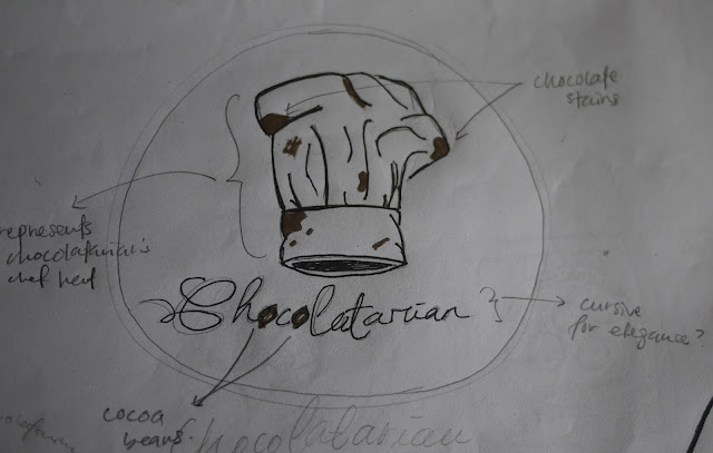


I chose the chef hat with chocolate stains. The chef hat
represents the chocolatarian’s hat. I thought it was simple. And the chocolate
stains on the chef hat made it fun.


The font, was another thing to decide on. I wanted my font
to be elegant so it could complement the chef hat with the chocolate stains. I
had sketched a few that I thought was acceptable.

When it came to digitalizing the logo, I picked out a few
fonts and tried it out with my chef hat.

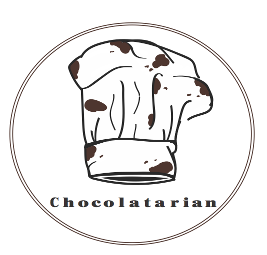


I haven’t settled on one perfect font and even the chef hat
needs some changes.
So far, this is all I’ve got for my logo.


- Qasryna
No comments:
Post a Comment