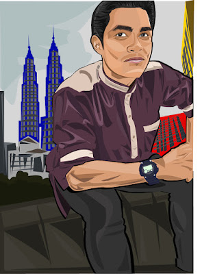
Greetings! Its been a while, but i finally get to finish most
of my projects. The exhibition is less than two weeks away, so i am
quite ready for it.
Both above are the first draft of my vector portrait. The first draft was all dark and gritty, and that was why my lecturer advised me to change the color of the background into a brighter one. My attempt of doing so went horribly as you can see in the second picture, i tried to blend the colors of Malaysia's flag (Blue, Red and Yellow) into the buildings and it turned out looking goofy and absurd.
This is the finalized version of my vector portrait. I added a shade of yellow in the background, changed the color of the pants into blue and change the road divider that the subject is sitting on into yellow and light grey. It turned out really well. Then, i printed out the piece and mounted it on an A2 sized cardboard for the upcoming arts exhibition.
 |
| Maybe because of the over exposure, the picture looks too bright. But the burn of CYMK color is real LOL |


No comments:
Post a Comment