Monday, October 19, 2015

PROGRESS UPDATE: The Day Before the Exhibition/Evaluation

The semester is ending, and we've all got finals to look forward to. But for us, we've got another thing in store before our exams, which is our evaluation. This is where all our work thus far throughout the semester will be showcased for everyone to see, and for us to be tested with our product designs.

We just finished setting up the boards for our own respective corners today. Here are a few sneak peeks of mine.


My business stationary!

The portrait vector that probably reduced 3 years worth of youth from my soul.


rimbamelaka.com is currently online (or, more like on-board, get it?)

Behold, the Radhii Corner.

As you may have noticed, my letterhead is nowhere to be found on the board. This is because I took it down myself, because I just noticed that it needs to be re-printed, with the help of Miss Ida's observations.

Although D-day is tomorrow, we're still busying ourselves, hoping that whatever product design we come up with suffices and works well. My product designs so far were okay, but I keep forgetting the minuscule but important things. Like the halal logo. Oh, deary me, is my product non-halal?

Aside from that, my mock-up so far has been going alright, but the measurements never match up. And I just found out the reason why.

All this while, I've used the Crispix box as my reference, but it turns out that the boxes that I'm using now, which are the Reese's Puffs boxes look completely similar but HAVE DIFFERENT MEASUREMENTS. Personally, I'm surprised because when I bought them, I even brought the Crispix box with me and compared them to each other to make sure that I didn't buy anything that measured differently than my original measurements.

Thankfully, my design has been finalized, and all that's left to do is remeasure everything. If they still read the same numbers, I'm going to have to find another solution.

Aside from that, I've finally gotten my instant cereal bowl wrap-around shape, but it's still a bit off at some parts, generally the wordings. They never bend the same way, but I'll do my best to make them bend them same way! I was also told that the lid of my instant bowl isn't exciting enough, so here's another night of illustrations of Eii and Kann! Come to my rescue my mermaid babies!

Once I get all that sorted, I can finally face tomorrow with confidence. Hopefully, I'll make it in time.

In any case, this semester has been a crazy one, especially since my "engine" starts late, and is really, really slow. Though, it's the most fun one I had, and I'm glad I got to study design.

That being said, I hope it'll end well! And for that, I'll need to get started on my final edits!

Godspeed, everybody!

Wednesday, October 14, 2015

Rumah Serambi Pahang: Website Progress

Hi!

For my website, Rumah Serambi Pahang, all the layouts are already finalized and printed out for an upcoming exhibition. The website is basically designed with a modernized template, but the mixture of cream color and dark brown fonts are intended to create a feeling of traditional lifestyle, parallel to the information served on the site.

 The opening page is an image of the door of a Rumah Serambi Pahang, edited to create an exciting element to attract the readers/viewers of the website.

 The homepage is just as good as the few drafts before, i added an advertisement for Coffee Dany below the page.


 The History page is just as good as the previous draft.

Basically, everything is just the same as the previous draft. The flowchart of the website is still in process, but i'll show you the printed version of my website (as a bonus) for this post. LOL


Thanks for reading! :)

Coffee Dany : Packaging and Stationery Items Progress

Hi!
For Coffee Dany's packaging and company stationery items, i have almost done with everything, just a slight issues that made me have to redo a certain piece- but that's alright. Here are my progress for product packaging :


Final design for Mocha Kaw by Coffee Dany, a bottled coffee drink

Final design for Kelatte by Coffee Dany, a canned coffee drink

Final design for Premium Coffee by Coffee Dany, a bottled coffee drink
After being printed out and pasted on bottle and can, the design looks pretty awesome and satisfying.


 The packaging is printed on glossy papers, and is UV-laminated to create an exclusive look on itself. Although, some alteration needs to be done fo the premium coffee packaging because the bottle was slightly damaged during the process.

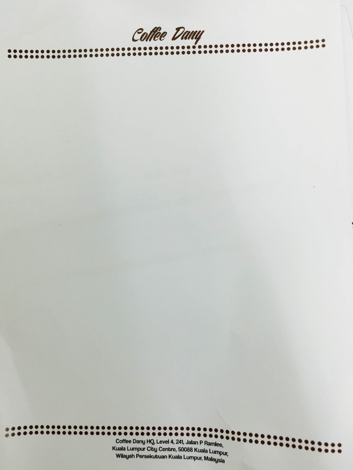
For my stationery items, all of it comprising a business card, an envelope and a letter head have been printed out successfully. Here is the results:


My business card is printed on a art card, UV-laminated to add an exclusivity for the cards beholders.

The letter head of the company is simple, yet resembles the same corporate design to show the strength of the corporate color and design of the company.
Same for the envelope, stripes of dark brown  dots  are presented in front and at the back of the envelope. A printed seal of the company's logo is printed on top of the envelope flop.

That is all for Coffee Dany product packaging and stationery items. Thanks for reading!

Company Stationary and Packaging

Next update is on my packaging designs. What started out with 3 different types of packaging ideas, narrowed its way into just 2 different packaging.  A chocolate truffle box and a simple chocolate bar.

After settling on the flavors for each type I started working on the illustrations. For the chocolate box I settled on a caramel flavor. I found a perfect sample box size that works like a matchbox. Except its square and of course, bigger. So the idea is to print on my selected paper which is brown Kraft paper, and wrap the sample box. Using spray mount of course. 
The original design of the box has a simple flat background. But after a few consultations, a background pattern was thought necessary.  So I traced a simple image of cocoa beans and changed it to the international color of the selected flavor. This is the final design of my chocolate truffle box:


And this is the final design of my raspberry chocolate bar:


Both to be printed on brown Kraft paper and wrapped neatly.
And these are my stationery items.

The final design of my letterhead:

The envelope:
And lastly, my business card (also printed on brown Kraft paper):


The designs of my stationary items are made to look simple. I believe this provides a fresh and a more professional look for my chocolate company.

-Qas

Vector Portrait Progress


Greetings! Its been a while, but i finally get to finish most of my projects. The exhibition is less than two weeks away, so i am quite ready for it.


Both above are the first draft of my vector portrait. The first draft was all dark and gritty, and that was why my lecturer advised me to change the color of the background into a brighter one. My attempt of doing so went horribly as you can see in the second picture, i tried to blend the colors of Malaysia's flag (Blue, Red and Yellow) into the buildings and it turned out looking goofy and absurd.
 This is the finalized version of my vector portrait. I added a shade of yellow in the background, changed the color of the pants into blue and change the road divider that the subject is sitting on into yellow and light grey. It turned out really well. Then, i printed out the piece and mounted it on an A2 sized cardboard for the upcoming arts exhibition.


Maybe because of the over exposure, the picture looks too bright. But the burn of CYMK color is real LOL
That's all for this post. Thank you for reading!

Project RIMBA MELAKA: Web Design Project UPDATE

In the end, I decided to call it rimbaMELAKA.com, seeing as "rimba" means "jungle," it would suit my website's theme, which is to showcase Melaka's animals.


The initial and very ugly logo of the website looked like this. It didn't take long to be rejected, so I had to go back to the drawing board. Alas, I ended up just using the marie dolores font with the same color scheme. Hopefully, it'll look much nicer.

In the end, I didn't end up changing much. I just added the rimbaMELAKA logo, and decided to hand-write all the information instead of typing it

Here is the re-vamped Home Page.
Here, we have the new and improved "Who's The Author" Page.


As for the layout during the showcase, I plan on arranging them as so:


The main three pages will be situated on the left, while the content pages will be arranged on the right. Arrows will be placed to show which page will give access to the other to provide convenience.

Vector Portrait Update - Qas

Just a few updates on our recent assignments and project.
First up is my vector portrait. 

It took me a really long while to compete the face and too be able to make the skin tones smoother and more umm “natural-looking”? A huge thanks to Atikah for helping me out on the sides.
So after I’ve completed the face I changed the color of the scarf and tried to decide on the background. 

Of course a simple colored background is not enough to really make this vector portrait ‘pop.’  And the red scarf really gives off a little red riding hood vibe so I decided to spring for a night forest or woods background. 


After completing the background, I had to change the hair color because it was drowning in with the background too much. At first I wanted to make it brown but in the end I decided that a little midnight blue would be perfect.

So I changed the color of the hair and the highlights of the hair and this is the final design:


-Qas